THE
AMAZING SPIDER-MAN OMNIBUS
VOL. 2 (Marvel,
First Printing, 2012; Hardcover)
Collects
The Amazing
Spider-Man #39-67,
Amazing
Spider-Man Annual
#3-5, The
Spectacular Spider-Man
#1, 2, and
the Spider-Man stories from Not
Brand Echh
#2, 6, 11 (cover dates August, 1966- December, 1968)
Writer:
Stan Lee
Artists:
John Romita, Sr. with Don Heck, Larry Lieber, Jim Mooney,
Marie Severin, Mike Esposito, Bill Everett, and Frank Giacoia

While
I love Steve Ditko, I prefer the artwork of John Romita, Sr. a whole
lot more. I remember teenage me arguing with some nerds at the comic
shop circa 1987. This guy said Ditko all the way. I argued that Ditko
is great and laid the foundation, but it was John Romita, Sr. who
defined the contemporary Spider-Man that we know and love. This was
right before Todd McFarlane would do a hard reset and make Ditko the
only acceptable reference point for the character for decades to
come. Those of us who were Bronze Age children know Romita's version
as the one who adorned t-shirts and luncboxes.

This
stuff is art of the highest order. There are too many highlights for
me to do a blow by blow, but I'll take a shortcut and tell you that
if you are not familiar with this run that it is top shelf material
and it belongs in everyone's library.

The
OCD zone-
This
is the part where I go into tactile sensations and materials used in
physical media. Those with heart conditions, high blood pressure, or
women who are pregnant should exit my blog at their earliest
convenience, as their safety cannot be guaranteed beyond this point.

PLEASE
NOTE THAT THE FOLLOWING APPLY TO THE 2012 FIRST PRINTING OF THIS
BOOK.
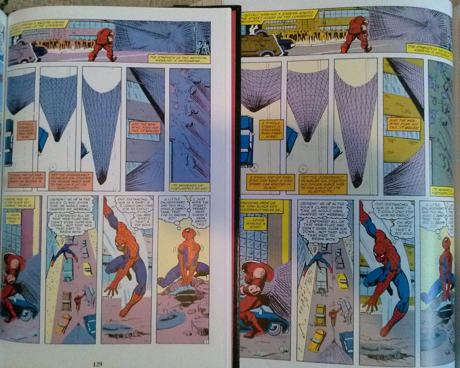
Linework
and Color restoration: There are a couple of issues here
which look like they could be improved upon if better source material
surfaced. I am uncertain if the second printing of this book used any
original artwork which may have surfaced since this book was
released.

Paper
stock: Coated stock with a slight sheen. This is closer to
glossy than matte.
Binding:
Sewn binding. Like many older Omniboo, this has developed the dreaded
Omnibus sag due to gravity and the weight of the book block. Some
folks use post it note pads to prop up the block, others store them
spines down. I like to live dangerously and store my books
vertically.
Dustjacket
and Hardback cover notes:
Laminated dustjacket. The hardback has faux leather grain and dye
foil stamping. The second printing does not have that.

The
hardback has ugly creases on it after reading it.