Tuesday, October 16, 2012

Review- PLANET OF THE APES VOL. 3: CHILDREN OF FIRE


PLANET OF THE APES VOL. 3: CHILDREN OF FIRE (Boom, 2012; Softcover)

Collects Planet of the Apes Nos. 9-12 (cover dates December, 2011- March, 2012)

Writer: Daryl Gregory

Artist: Carlos Magno

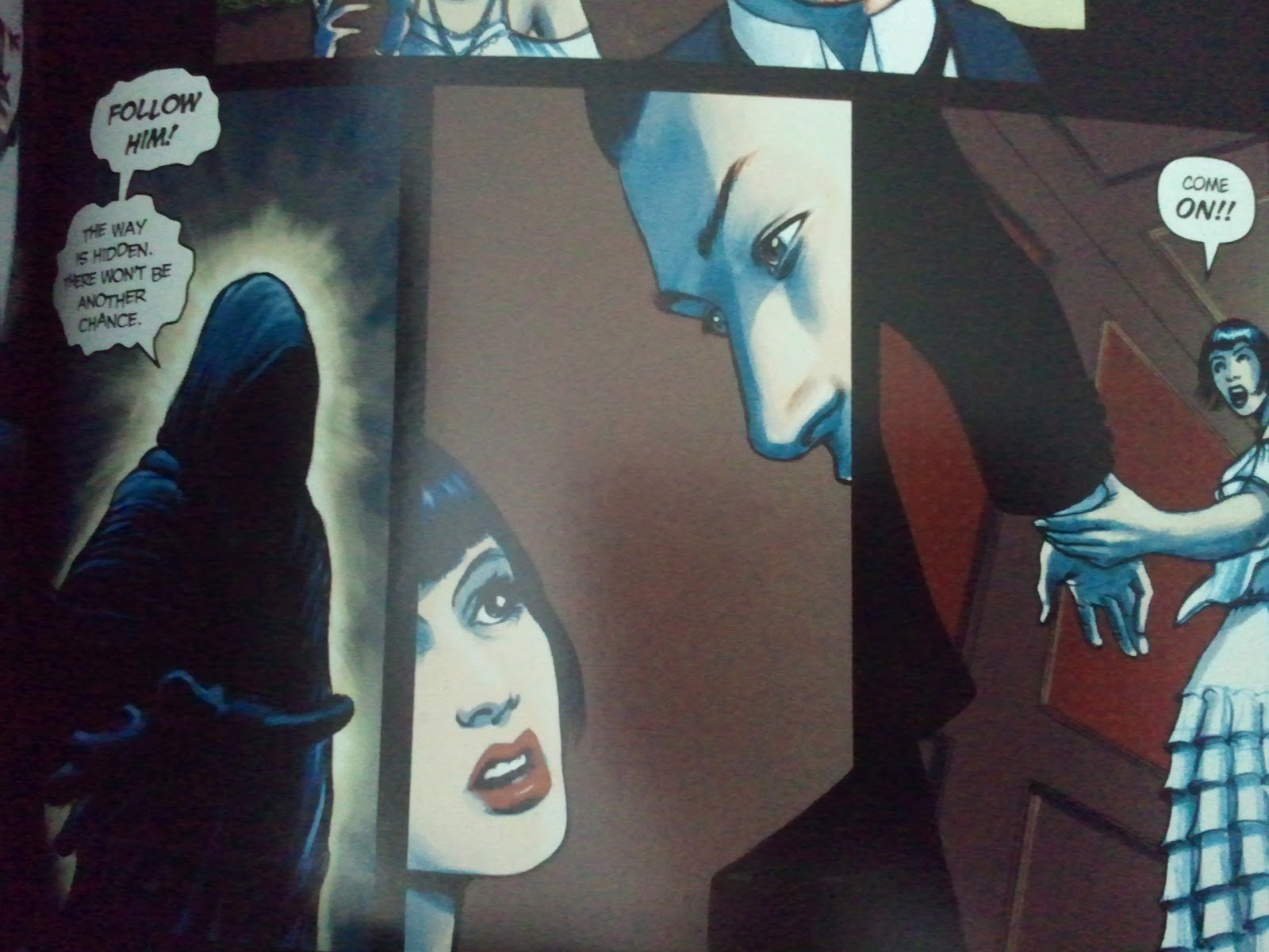
War! Tensions have bubbled over, tempers have flared and turned into raging infernos, and the battle for Southtown is on. On one side, the humans; second class citizens whose offspring are now being born mute for reasons unknown. On the other, the apes, divided into several species and factions: The gorillas, the chimpanzees, and the orangutans. All of have their own motives, and not all of those are in the best interest of the humans. There is an underground human resistance who have hoarded old world human technology: guns. The apes are seemingly outclassed here in this era, set many years before the events in the 1968 film. Or are they?


Daryl Gregory and Carlos Magno continually churn out quality material, and I automatically bump up each new book to the top of the reading pile upon release. I really enjoy Magno's artwork and Gregory's writing. Volume 4 is forthcoming, and I can't wait to see where this all going.


Junk Food For Thought rating: 4 out of 5.

The OCD zone- The paper in this book, which was made in China, has that dirty, powdery feeling to it. Sometimes these Chinese made books have this rough, crappy texture to the paper, and this is one of those times. The coating in inconsistent throughout the book, with maybe 1 out of every 4 pages being smooth, and the rest feeling either like sandpaper or having that gross powdery feeling. Either way, me no like. I do love the smell of these toxic Chinese inks, though.

The cardstock cover has a decent coating that will help ensure the durability of the book.

Paper rating: 3 out of 5.

Binding rating: 4 out of 5.

Cardstock cover coating rating: 4 out of 5.

Sunday, October 14, 2012

Review- G.I. JOE YEARBOOK


G.I. JOE YEARBOOK (IDW, 2012; Softcover)

Collects G. I. Joe Yearbook Nos. 1-4 (cover dates March, 1985- February, 1988)

Writer: Larry Hama

Artist: Herb Trimpe, Michael Golden, and Ron Wagner

IDW are completely clueless when it comes to collecting G.I. Joe. You'd think that when they set out to reissue the classic Marvel run of the title that they would have spent a few minutes online figuring out crossovers, etc. Instead, they issued Classic G.I. Joe, which collected the core series, G.I. Joe A Real American Hero. Then they released the G.I. Joe Special Missions trade paperbacks, collecting that series over the course of four trades. Now we have the G.I. Joe Yearbook trade paperback. They should have collected all three into one cohesive line. Oh wait, they are going to do that...in hardcover, now that everyone has already bought of all them. Bastards. 

Artwork by Herb Trimpe.
I wonder if they will include the G.I. Joe Vs. The Transformers '80s series in with those hardcovers? IDW issued a separate trade of those crossovers. That choice almost made sense, since both G.I. Joe and the Transformers have been licensed to multiple comic companies over the years, and there have been crossovers from multiple companies. They landed over at IDW a couple of years ago, and IDW has made some decent choices with new material, such as resurrecting the Marvel continuity for both properties, getting Larry Hama back on the title, etc. My beef is with the way that they presented the material in this book. Let's get started, shall we? (*cracks knuckles*)

If you did a shot for every panel marred by poor restoration, you'd die of alcohol poisoning.
G.I. Joe Yearbook No. 1 was appealing to me as an 11 year old upon it's newsstand release in December of 1984 because I didn't get in to the G.I. Joe comics until issue 23 in February of that year. The bulk of Yearbook No. 1 was a reprint of the at-the-time expensive first issue of G.I. Joe A Real American Hero. This was already collected in Classic G.I. Joe Vol. 1, so this was nothing more than padding in my opinion. Had they collected this in proper sequence, this could have been omitted. The linework doesn't look too bad for this issue. 

Artwork by Michael Golden.
The linework restoration in Yearbook No. 2 is superb, worlds better than the crap that IDW passed off on us for the rest of the books. I wonder why the lines are so sharp and clear in this story while the other three issues are a pixelated mess. My guess is that they had access to Michael Golden's original artwork. 

Which is worse: the horrible linework or the cheesy airbrushed recoloring?
The other two issues in this book suffer from same the subpar production values that IDW had for Classic G.I. Joe Vols. 6-9. Those books are complete crap, production-wise. I have reviewed them all here in my blog. Click on the G.I. Joe tag below and see for yourself. IDW created typos. The linework is obliterated. They use crappy substandard computer recoloring, allowing the computer to fill in the shapes which resulted in poor gradient blends and “airbrushed” looking lines. There are rampant jagged lines due to low resolution scanning of the floppies. I would have rather seen them just do straight scanning of the pages than this crap. Dots would have been preferable to this garbage. I wonder if they even bothered asking Marvel to use the files for these issues. Wouldn't have hurt to ask. 

Yup, IDW actually CREATES typos in these books. This is pathetic. These typos are not found in the original issues.
The stories in and of themselves are fun, but the shoddy presentation ruined this book for me. I would advise everyone to pass on this book unless you cannot live without this material in collected edition format. Rating below is based on the stories themselves.
Junk Food For Thought rating: 3 out of 5.

The OCD zone- Super thick uncoated paper stock and sewn binding glued square to the spine make this a tough read. You have to almost pin it down like a wrestler to read this book. I don't like fighting with my books just to be able to read them.
The cardstock cover has coating on it, but not as nice as what Marvel uses.

I went over all of the restoration shortcoming above. Let me reiterate: AVOID THIS BOOK.

Linework restoration rating: 1 out of 5. (It would have been a 0 if not for Yearbook No. 2.)

Color restoration rating: 2 out of 5.

Paper rating: 5 out of 5.

Binding rating: 3.5 out of 5.

Cardstock cover coating rating: 4 out of 5.

Friday, October 12, 2012

Review- KISS/ MONSTER

Kiss/ Monster (Universal, 2012)
Monster, Kiss' 20th studio album*, is a complete and total jam. It sounds old school and authentic from top to bottom, from the songwriting to the singing to the production. This, kids, is what we call Rock and Roll. No loops. No samples. No Protools or autotune. Human beings playing instruments. No outside writers.
Every song is a winner, and it has those comfortable moments that will remind you why you fell in love with Kiss in the first place. Yes, it sucks that Tommy Thayer and Eric Singer wear Ace and Peter's make-up, but don't let that deter you from giving this album a spin. Tommy Thayer does the best Ace Frehley guitar solos since the band's '70s heyday. All four members co-write the songs, and all four take turns doing lead vocals. In other words, this is an authentic old school Kiss record.
For the first time since Unmasked, I missed buying a new Kiss album on the day of release. My life is now meaningless. I had thought that the originally announced October 16 release date still stood, not realizing that the album was bumped up a week. I didn't discover it until Wednesday the 10th while shopping at Target with my daughter. I spotted it on the endcap and flipped. I couldn't believe that I missed it. I missed out on 24 hours of jamming this album. I broke tradition. And worst of all, I will likely be given a dishonorable discharge from the Kiss Army for deserting my post.
*Not counting live albums, the 1978 Kiss-branded solo albums, or any of the compilations or box sets, even those with previously unreleased material like Killers.
Junk Food For Thought rating: 4.5 out of 5.

Follow my blog on Facebook.

Wednesday, October 10, 2012

Review- JUDGE DREDD: DREDD VS. DEATH


JUDGE DREDD: DREDD VS. DEATH (2000 AD/ DC, 2005; Softcover)

Collects selections from 2000 A.D. Nos. 50-52, 57, 110, 120, 127, 149-151, 224-228 (cover dates February 4, 1978- September 5, 1981)

Writers: John Wagner and Alan Grant

Artist: Brian Bolland

I am a sucker. I saw the new Dredd flick and then started seeking out books. There is a forthcoming Judge Dredd: The Complete Brian Bolland hardcover from IDW, which reprints all of these stories plus more, all newly colored and in hardcover. I'll pass on that but figured that it is worth mentioning for those interested it. I figured that his highly acclaimed run would be a great place to dip my toe in the water. Unfortunately for my wallet, the water is so fine that I plunged in with both feet and already acquired Judge Dredd: The Complete Case Files Vol. 1. There are 19 of those. Ugh.

2000 A.D. was responsible for helping to launch the careers of the '80s British invasion of creators like Alan Moore, Alan Davis, Brian Bolland, and other exceptional talents. Bolland's artwork was very good early on, and before too long he achieved the greatness which I present in these pictures here. The writing is extremely clever here as well. The Dark Judges are from an alternate reality where they determined that all crime is the byproduct of life. Their solution? Eliminating all life would equal the elimination of all crime. Genius, or so I thought. When I told my wife about this as we were reading in bed, her unqualified opinion was “that is stupid”. What does she know? She only has a collection of degrees.


The violence in these stories is over the top since British comics weren't subject to the Comics Code Authority and these were only available over here in the US as scarce imports. Every aspect of this series holds up well some 30 years later. The artwork looks every bit as fresh as something in a modern comic book, a testament to Bolland's visionary talent. I love his covers on Jack of Fables but have never read the series.


In typical DC fashion, the covers to most of the issues are not included. They threw a few Bolland covers in, some to the issues collected in this book, most of them not. It's not like this was a Bolland branded collection, just that DC are a bunch of assclowns without a clue how to put together a comprehensive collected edition. 


This is a great read that is still available if you look in the usual spots, but I wouldn't wait too long. A lot of these books are falling out of print, as I've discovered with a few others that I tried ordering recently. 


Pointless, mostly unrelated commentary: I had the Anthrax Among the Living tour shirt with Judge Death on it back in high school. I wore the shit out of that thing, and part of me wishes that I still had it. I wouldn't wear it anywhere these days, so whatever, no biggie. Just waxing nostalgic. 
Junk Food For Thought rating: 5 out of 5.

The OCD zone- This book is slightly wider than a standard DC trade paperback, being printed in the exact dimensions of the UK version. The paper is outstanding dull matte finish coated stock and smells wonderful. The cardstock cover has a nice thick wax coating that makes me happy. I am ill, but I own it.

Linework restoration rating: 5 out of 5.

Paper rating: 5 out of 5.

Binding rating: 5 out of 5.

Cardstock cover coating rating: 5 out of 5.

Monday, October 8, 2012

Review- CROSSED: WISH YOU WERE HERE VOL. 1

CROSSED: WISH YOU WERE HERE VOL. 1 (Avatar, 2012; Hardcover)
Collects Crossed: Wish You Were Here weekly web comic Chapters 1-19 (posted dates March 22, 2012- August 30, 2012)
Writer: Simon Spurrier
Artist: Javier Barreno
Here we are, five hardcovers into the Crossed collected editions. (I count the Crossed 3-D original graphic novel- your mileage may vary.) While Crossed: Wish You Were Here has plenty of the over the top violence and gore that we have come to expect from the sick f*cks at Avatar Press, there is a more emphasis on the characters than the mayhem this time out. For the first time since this series began, we have suspense and tension inserted into the mix.
Things move at a slower pace, and the people in the camp of the Calf of Cava almost wish for something to happen. The problem is that things start to happen. Then things really start to happen, and the book ends. Aaaarrgggghhh!! Now we have to wait for Volume 2 to see what happens. Or you can visit the website and get a new episode each week. I'll just wait for the hardcover, as I loathe digital comics. Hey you, get out of the way of my tar pit!
This is written in a narrative by the star of the series, a writer by the nickname of Shaky (short for Shakespeare). We see the events presented in a semi-linear fashion, but with flashbacks and diary writing filling in the blanks later. This is reminiscent of the seemingly out of sequence time slips in the original Crossed series. We still don't have an answer as to what originally caused the Crossed to become...well, the Crossed. We know how the infection is transmitted, but we don't know the cause nor do we know the cure. I am cool with that. I like to be left begging for more rather than having all of the answers.
It is also cool how the events in all of the Crossed series take place in roughly the same space of time. They could do a million issues, since this is apparently occurring simultaneously all over the globe. 
I do have a nit-picky type of complaint. There is a small disclaimer in the indicia that states that all actions are portrayed by characters 18 years of age or older, yet one of the female characters is 15 years of age and is clearly doing things with people, implied or otherwise, that are inappropriate and do not comply with that statement. I don't really give a rat's ass myself. Just sayin', as them Millennials are wont to say.
Junk Food For Thought rating: 4.25 out of 5.
The OCD zone- Like all Avatar Press hardcovers, this has no dustjacket. Instead, the image is printed on the hardback itself and sealed in a super thick, wax-like coating that is extremely durable and nice. The paper is a decent weight coated stock. The book has sewn binding, but the casing is glued square into the spine. Fortunately, the book isn't very thick, so it lays reasonably flat in one hand while reading. This is the ideal way to read books under 300 pages, in one hand like a periodical.
Oh, and why is it that the softcover (trade paperback) releases always have cooler covers than the hardcovers? It's madness I tells ya! Madness!
Paper rating: 4 out of 5.
Binding rating: 4.5 out of 5.
Hardcover coating rating: 5 out of 5.

Follow my blog on Facebook.
Join my Facebook group, DC Collected Editions Fans Who Want Sewn Binding and Books That Lay Flat, a watchdog organization dedicated to top notch production values in DC's collected editions.

Saturday, October 6, 2012

Review- THE HAUNT OF FEAR ANNUAL VOL. 3


THE HAUNT OF FEAR ANNUAL VOL. 3 (Gemstone, 1996; Softcover)

Collects The Haunt of Fear Nos. 11-15 (cover dates February- October, 1952)

Writers: Al Feldstein and Bill Gaines

Artists: Graham Ingels, Jack Kamen, George Evans, Jack Davis, Johnny Craig, Joe Orlando, Sid Check, and George Roussos

Colorist: Marie Severin

EC is the gold standard, not just for Horror comics, but for comic books as a whole. Don't believe me? Pull out any other comic book from 1952, any genre, any publisher. Only Flash Gordon or Prince Valiant hold a candle to the sophistication of the artwork and writing that EC had. This was art for the sake of art. Jack Kamen and “Ghastly” Graham Ingels toiled in obscurity and near-poverty, and their work was worlds better than it had to be. They could have just tossed off “good enough” work, but the artists in the EC stable all sought to impress one another with their work. The readers reaped the benefits of this friendly competition.


The writing is also a cut above everything else going on at the time. While Al Feldstein was known to occasionally lift ideas (“liberal adaptations” sounds classier) from other stories, the ironic twist ending and black humor that was an EC hallmark were all his. The Twilight Zone and Rod Serling owe a huge debt to EC. 


While I enjoyed every story in this book, I'll list my favorites. In The Acid Test (HoF No. 11), Jack Kamen illustrates beautiful people doing ugly things, in this case an unhappily married couple. Well, the husband is happy, but the wife...not so much. This formula (unhappily married couple= carnage) is repeated throughout the book. “Ghastly” Graham Ingels...while it is extremely difficult to pick which one of his masterpieces is the best in this book, I'll have to go with For The Love of Death (HoF No. 13). In this story, a lonely, disturbed elderly man by the name of Morton Macawber goes to funerals because he feels that only in death are people treated with the respect that they deserve. This causes him to brainstorm how he could be that loved, that missed, and this is when Macawber (har-har) goes off of the deep end. Sorry, but this remains a no spoiler zone, even on 60 year old comic books. 


Jack Davis' best piece in the book is Wolf Bait (also HoF No. 13), which ends with a question rather than an answer. Remember how John Carpenter's 1982 remake of The Thing ended, where you just didn't know the answer, nor would you ever know? Well, it's the same thing here, and I love it!


Finally, George Evans' All Washed Up (HoF No. 15) is a beautifully rendered story about...you guessed it, love won, love lost, someone snaps, and then we're off to the races. Some folks may call these stories formulaic, but you must read them with the era that they were originally published in in mind. 


Every issue is divided into three parts, with the hosts trading off each time, just like they do in all of the other EC titles. The Old Witch hosts The Witch's Cauldron, The Vault-Keeper hosts The Vault of Horror, and last but certainly not least, The Crypt-Keeper hosts The Crypt of Terror. They all have terrible puns about the story and insult each others stories each time out. This is the model emulated and imitated by every other Horror anthology.
Junk Food For Thought rating: 5 out of 5.

The OCD zone- If you do not know what an EC Annual is, then pull up a chair. I'll give you the skinny on these great books. Gemstone overprinted their single issue reprints in the '90s with an eye towards selling their own back issues. They re-purposed this overstock by gluing 5 entire issues into a cardstock cover. While this is not technically a trade paperback (it has no ISBN), it is squarebound and has the title name on the spine. Close enough for Rock and Roll in my book. The comics themselves are printed on the mando/heavy pulp paper of the day. The water based inks looks fine, although the blacks look weak on this paper, like they didn't sink in correctly. I am not sure if this is the ink or the paper's fault, as I am not an expert on the printing processes used in these books. I can spot bad restoration and reproduction a mile away, but the nuts and bolts of the printing process is out of my realm of expertise.

William Gaines kept the original artwork, or filmed it, and so what you have are superb presentations of this material with no line dropouts. The color palette is largely faithful to the original material, although some of Marie Severin's color choices on the cover recolorings are questionable. I would love to see a purist line of these books done with all of the original color palettes once they complete the EC Archives. I know, I know, would I like fries with that? I am not above making tall orders, especially where EC is concerned. These pages should be hung in museums for all to appreciate and admire.

Linework restoration rating: 5 out of 5.

Color restoration rating: 5 out of 5.

Paper rating: 3.5 out of 5.

Binding rating: 4 out of 5.

Cardstock cover coating rating: 4 out of 5.

Follow my blog on Facebook.

Join my Facebook group, DC Collected Editions Fans Who Want Sewn Binding and Books That Lay Flat, a watchdog organization dedicated to top notch production values in DC's collected editions.

Thursday, October 4, 2012

Review- REX MUNDI OMNIBUS VOL. 1


REX MUNDI OMNIBUS VOL. 1 (Dark Horse, 2012; Softcover)

Collects Rex Mundi Nos. 0-17 and the three Brother Matthew web comic strips (cover dates August, 2002- March, 2006) (Originally published by Image Comics.)

Writer: Arvid Nelson

Artists: EricJ, Jim Di Bartolo, Juan Ferreya, Brian Churilla, Jeromy Cox, and Jason Millet


Rex Mundi is Latin for “King of the World”. In the Paris of 1933 we see a conspiracy of power going all the way back to Biblical times, with royal lineages and birthrights mixing with sorcery and cults. Then again, what is Christianity but a cult gone mainstream, right? There are lots of questions about all religions in this title. Many of the things that religious conspiracy stories like The Da Vinci Code touch upon, such as the Holy Grail, are covered here. Rex Mundi was being published before Dan Brown's book, so it is not entirely fair to call this title a copycat. Rather, we'll call it two creative minds going down the same road but getting off at different exits. 


This starts out as a whodunit, but quickly progresses into other territory. This is a very slow building story, with seemingly disparate scenarios and characters converging at a later point once the story gets going full steam. Once it achieves it's momentum, the unfolding plotlines will make this a book that you won't be able to put down. The writing and artwork improve with each page. 


Speaking of artwork, this title changes hands a few times, with each artist brings something different and unique to the table. None of them derail the feeling of the previous artist, yet they offer something completely different than their predecessors.

Junk Food For Thought rating: 3.75 out of 5.

The OCD zone- These Dark Horse Omnibus books offer maximum bang for the buck, clocking in at 584 pages in full color for $24.99 MSRP. These books are slightly smaller than a standard trade paperback but are larger than a digest. The paper is a decent weight coated stock but the coating is inconsistent throughout the book. Some pages are as smooth as a baby's bottom while others have that dirty, gritty, “dusty” Chinese printing feeling. When the Chinese go cheap, the paper feels gross. If the children working the sweatshop presses can't get it right then I suggest we exploit another Third World country who will do a better job.

I wish that the original cover art that was prepared exclusively for the trade paperbacks was included as extras in the back of the book. The cover to this book is the cover to the Volume 3 trade paperback.

This book has high quality sewn binding and will last a lifetime. My 5 year old son has one of the Star Wars Dark Horse Omnibus books with the same binding, and it is beat to Hell with nary a creak in the binding or loose pages. He sleeps with it, leaves it open face down overnight, etc. If you handle the book that carelessly and it lasts, let alone when you handle them as gingerly as I do, then I give it the buy with confidence vote.

Paper rating: 4 out of 5.

Binding rating: 5 out of 5.

Cardstock cover coating rating: 5 out of 5.