Showing posts with label alpha flight. Show all posts

Tuesday, April 28, 2015

Review- INCREDIBLE HULK: CROSSROADS


INCREDIBLE HULK: CROSSROADS (Marvel, 2013; Softcover)

Collects The Incredible Hulk Annual #13, The Incredible Hulk #301-313, and Alpha Flight # 29 (cover dates November, 1984- December, 1985)

Writer: Bill Mantlo

Artists: Pencilers- Sal Buscema, Alan Kupperburg, Bret Blevins, and Mike Mignola

Inkers- Gerry Talaoc and Al Williamson

Bill Mantlo's run on this title has to be one of the most underrated runs of the 1980s. I'm not kidding. Aside from #312 and 313 (which I bought when they originally came out- more on that later) these comics were all new to me, and they are all great. Mantlo's writing may seem overly wordy to modern reader sensibilities but bear with it, kids. He crams an arc's worth of characterization into every single issue and there is one helluva payoff at the end of the day, nearly 1200 pages across these three books later.

The Hulk has been banished to the Crossroads by Doctor Strange in an attempt to save both the Earth and the Hulk. Due to Nightmare's interference, Bruce Banner's intellect was squashed and the Hulk became a truly mindless beast. When Strange intervened Banner essentially committed suicide of the id, allowing a mindless Hulk to wander through the Crossroads, which is a nexus to different worlds and dimensions. Strange implanted a fail safe spell in the Hulk's mind so that if the mindless Hulk became discontented he would be transported back to the Crossroads, free to pick a new world until he found one that made him happy.

The Hulk encounters foes of all types in this dimension. Worlds where all of his strength is useless, as he is the weakest being (#302-303). Worlds where a symbiotic creature attaches itself to the Hulk and learns to dream (Annual #13). He befriends an entity called the Puffball Collective which is trapped in the Crossroads and unable to enter any of the worlds. There is a ton of development with that entity, and it ends up helping the Hulk before revealing it/their hand. The N'Garai appear in the finale, and that battle is pretty darn cool.

Yes, the N'Gari were clearly "inspired" by the movie Alien.

As if all of this isn't enough, the remnants of Bruce Banner's psyche begin to reemerge as three personalities called The Triad (#308). Glow, a star-like creature that is Banner's intellect; Guardian, Banner's survival instinct; and Goblin, his anger, basically the devil on his soldier. These three personalities helped the Hulk when he was mindless but were of course invisible to everyone else. That's right, kids, years before the show Herman's Head set the world on fire for the fledgling Fox Network Bill Mantlo paved the road for it with this title. This is some pretty heady stuff and predates many so-called sophisticated comics. Their origin wasn't revealed until #312, which I bought as 12 year old sucker because it was a Secret Wars II tie-in. It was dry for my tastes back then, even though I enjoyed the artwork of the then-unknown Mike Mignola, who would go on to great success with Hellboy.

Herman's Head. I was one of the 20 people who watched when it originally aired, largely because my family was too poor to have cable and the Internet didn't exist.

I was suckered into buying #313 because it tied into Alpha Flight #29. AF was one of my favorite titles in 1985, and series writer/artist John Byrne was going over to The Incredible Hulk while Mantlo/Mignola/Talaoc were going over to Alpha Flight. The Beyonder set a chain of events in #312 which led to the end of AF #28 (which took place at the same time as #313) and beginning of #29. The whole thing ends with a bang, literally. It was a pretty clever way to tie up Mantlo's run as well as welcome Byrne to his ill-fated but highly advised run.

I was harsh about Gerry Talaoc's inking in my review for the previous volume, Regression. I stand by that critique, as his work in that book was substandard. He really shines here, though, having figured out how to compliment Sal Buscema's pencils perfectly. He also works well with a young Mike Mignola.

Bill Mantlo is a great writer who did what many comic book writers fail to do. Take a character, put that character through their paces, break things, and then carefully put everything back together the way that you found it. He put his stamp on the character without disowning what came before or making it impossible to follow without adhering to his take. Genius. It makes me sad that he still suffers from injuries sustained in a hit and run accident many years ago and is in assisted living. Hopefully royalties from reprints like this help him out. He is a writer whose work has always hit the mark and deserved a better fate than what he got. The driver who crippled him was never caught.
Junk Food For Thought rating: 5 out of 5.

The OCD zone- I love love love these thick chunky books! 400-500 pages is the sweet spot for me. I am sucker for complete chunks of a title. DC would do well to emulate this with their '60s-80s material. I would probably buy them all. Kill me now.

Linework and Color restoration: The film is in great shape and the color palette is faithful to the original publications. If there are variances they are minor enough that they don't bother me, so they likely wouldn't bother you since I tend to skew pretty anal about this sort of thing.

Paper stock: The same awesome matte coated stock found in softcover Masterworks, Epic books, and Classic line trade paperbacks. My favorite!
Binding: Perfect bound trade paperback.

Cardstock cover notes: Thick lamination on the cardstock cover.

Tuesday, December 10, 2013

Review- MARVEL MASTERWORKS: THE UNCANNY X-MEN VOL. 5


MARVEL MASTERWORKS: THE UNCANNY X-MEN VOL. 5 (Marvel, 2005; Hardcover)

Collects Uncanny X-Men Nos. 132-140, Uncanny X-Men Annual No. 4, Phoenix: The Untold Story No. 1, and the Phoenix story from Bizarre Adventures No. 27 (cover dates April, 1980- April, 1984)

Writer: Chris Claremont and John Byrne (co-plotter)

Artists: John Byrne (penciler), Terry Austin (inker); Annual 4- John Romita, Jr. (penciler) and Bob McLeod (inker)

Lennon and McCartney. Simon and Garfunkel. Claremont and Byrne. Like all great creative partnerships which produced art which has lasted through the ages, it was no picnic for those involved in the creative process. Two captains cannot steer a ship. The best creative partnerships can play off of the strengths of each creator involved, resulting in the sum being greater than the whole of its parts. Over time, things can become heated, and like the first two partnerships that I mentioned, Claremont and Byrne “broke up”...but that didn't happen until three issues after the ones collected in this book.

I have read these issues dozens of times, and their brilliance shines no less now than it did on the first read. Issue 132 metaphorically knocked the wind out of me as a teenager. The X-Men got their asses handed to them by the Hellfire Club. Time was that mutants were a rare, special thing, with only a dozen or two floating around the entire Marvel Universe. So it was a surprise for the X-Men to stumble upon this cabal of older, more powerful mutants who were more skilled in the use of their powers than The X-Men.

There was a time when Wolverine did not suck. No kids, I wouldn't lie to you. There was a time when a spray of bullets could wind the guy, where he could get knocked out in combat, or he could even get tired. The immortal, omnipotent ninja who heals instantly from an atom bomb did not exist when these issues were published. Wolverine was a feisty, cocky brawler. No “honor”, no martial arts discipline, only a slight healing factor. He developed a sense of smell during this era, “tracking” people by scent. His costume changed to the brown one that I grew up on in issue 139. Right around that time we found out his name: Logan. Wolverine was once one of my favorite characters. Now, he is unbelievable and unlikable on every level. I think that I even saw some promo art for a new series where he uses a gun for chrissakes. Yeah, because a guy with an unbreakable skeleton and claws needs a firearm. Sheesh. 


Issue 133 is the first Wolverine “solo” story where we really see him cut loose. It's totally badass on all levels and should make anyone who thinks that immortal omnipotent ninja Wolverine is a good idea feel foolish.

Time was that Cyclops and Professor X were good guys, noble leaders even. Nowadays...sigh. It's a pity that these characters are dead to me, having been crapped up beyond redemption. I have not bought any new X-Men comics in years, and won't buy one ever again unless Claremont and Byrne reunite to bring the magic back.

The Dark Phoenix Saga...what is there to say, aside from comic book deaths once had meaning and weight. Issue 137 is brilliant, with the team in the fight of their lives with the life of a teammate hanging in the balance. This issue became a hot book after the fact because it was, first and foremost, a great story. Nowadays comic book deaths are a meaningless, dime a dozen marketing gimmick to be undone in a year's time. Those stunts have all but made a mockery of powerful stories like this. The rewritten word balloons in Phoenix: The Untold Story were crap. The original ending, as published in that one-shot, would have been forgettable.

The icing on this delicious cake is the Alpha Flight/ Wendigo two parter in issues 139 and 140. I met John Byrne at the Mid-Ohio Con in Columbus, Ohio in 2004, the last convention appearance that he made. He hosted a panel but everyone was too shy to ask him questions. Never one to know when to shut up, I proceeded to ask him endless questions. After the panel I stood in line to get my Uncanny X-Men Masterworks Volume 4 signed by him. (It was the current volume at that time.) I apologized for my endless questions and proclaimed my love for his work on this title. He told me a few tidbits of things that he intended to happen in issue 139 during the sequence where Nightcrawler went out to the Jeep to get their gear, and how it was colored incorrectly in the original issue (sun instead of moon, making it daylight instead of night time) and how there weren't supposed to be any words on that page. It was supposed to be colored red, like how the Wendigo would see things in infrared. He signed my book, and I got Chris Claremont to sign it at the Motor City Con a year or two later. It's like having a copy of Abbey Road signed by Lennon and McCartney.

Annual 4 marks the first time that future X-Men artist John Romita, Jr. took a stab at the title. I really miss comics that had such depth and characterization while being action packed. Comics that didn't rely on variant covers, crossovers, or cursing to be “cool”.

John Byrne is my all time favorite comic book artist, with the power of Kirby combined with the fluidity of Neal Adams. Claremont is one of the greats. For as much as people complain that his writing is “overly wordy” they fail to understand how much depth he gave these characters. The fact is that without Claremont you would not have the X-Men today, period. He built the “franchise” into what it is, and for that he deserves more respect than he gets from fans these days. When he's dead and gone you'll all come out of the woodwork and state how much you loved his writing. I choose to say it while he's still alive. 


I must also give props to Tom Orzechowski, the greatest letter in the history of comic books. His clear, artistic hand lettering lent an air of elegance to everything that he applied his pen to. Letterers are like the cable company or the utility company...you never notice them unless they are not working right.

These issues are art of the highest order and should be packed up, along with the entire Beatles catalog, and sent on an interstellar journey to show aliens what beauty the human mind is capable of conceiving.
Junk Food For Thought rating: 5 out of 5.

The OCD zone- Marvel Masterworks are my poison of choice. This particular era of the Masterworks program was one of transition, from one of embarrassing mistakes to becoming the gold standard for comics restoration that many companies now employ.

I have bought and read this material so many times it is sad and sick. I had the originals via back issues in 1987-1988...then the original Uncanny X-Men: Dark Phoenix Saga trade paperback...then again in Essential X-Men Vol. 2...then this book...at least the first version of this book that I bought.* Then I bought this copy...and will possibly upgrade to the Omnibus.

*Way back when, I used to actually pre-order all of my books through my LCS (local comic shop for you civilians out there). They ordered the variant cover, which I hate because it has a number on the spine which is the number of the book in the entire line rather than the volume number in that particular line. I bought it anyways, but immediately regretted it. I sold it for a nice sum once the variant went out of print and then bought this “standard consumer edition” online.

DVD-style Extras included in this book: All are one page each.
#132 page 6 original art by John Byrne and Terry Austin.
#132 page 15 original art by John Byrne and Terry Austin.
#133 page 11 original art by John Byrne and Terry Austin.
#132 original cover art by John Byrne and Terry Austin.
#137 original cover art by John Byrne and Terry Austin.
Unused splash page for issue 138, which had to be scrapped because Jean Grey died in #137.

Linework and Color restoration rating: 4.25 out of 5. While the color palette is faithful to the original publications, the linework has noticeable pixelation in a handful of spots. Most folks wouldn't even notice it, but I tend to skew uber-anal retentive. Masterworks editor Cory Sedlmeier and company have since made the pilgrimage to the Sparta warehouse and performed the Herculean effort of organizing and cataloging Marvel's film library, revealing pristine film sources that have resulted in the line wide upgrade that we have seen in the various Omnibus hardcovers and 2009-on softcover Masterworks. The softcover release (linked below for sale from site sponsor In Stock Trades) has improved restoration over this hardcover release. These same superior files will be employed in the forthcoming Uncanny X-Men Omnibus Vol. 2, due out in 2014. These things can be confusing for new readers of the program, but elder statesmen like myself are here to help you guys and gals out.

Paper rating: 4.5 out of 5. Glossy coated stock paper was the order of the day for the Masterworks program of 2005. While not optimal for material with flat coloring, it is still a nice paper with a good weight to it.

Binding rating: 4.5 out of 5. This era of Masterworks were perfect bound, which in English means that they had glued binding. They still laid pretty flat in one hand and didn't bother me much at the time of release. It was the mousetrap glued binding books that would surface in late 2005 that would raise the ire of the faithful, but that is a story for another time...


http://www.instocktrades.com/TP/Marvel/MARVEL-MASTERWORKS-UNCANNY-X-MEN-VOL-5-NEW-ED-HC/NOV041834

Sunday, June 9, 2013

Review- ALPHA FLIGHT CLASSIC VOL. 3


ALPHA FLIGHT CLASSIC VOL. 3 (Marvel, 2012; Softcover)

Collects Alpha Flight Nos. 20-29 and Incredible Hulk No. 313 (cover dates March- December, 1985)

Writers: John Byrne and Bill Mantlo (Incredible Hulk No. 313 and Alpha Flight No. 29)

Artists: John Byrne (Penciler Nos. 20-28, Inker 20, 27, 28), Keith Williams (Inker, 20, 23, 25, 27, 28), Bob Wiaceck (Inker, 21-26), Mike Mignola (Penciler, Incredible Hulk No. 313 and Alpha Flight No. 29), and Gerry Talaoc (Inker, Incredible Hulk No. 313 and Alpha Flight No. 29)

These are some of my favorite comic books from my youth. I bought every issue off of the stands within their original publication month on the spinner racks at 7-11. John Byrne has said that he never really cared for these characters, that they were two-dimensional, and other things along those lines. While the creator may not have felt that these characters meant much, they meant the world to this 11-turning-12 year old kid in 1984-1985. Issue 20 was on the stands in December of 1984, and I picked up Issue 21 at the only Direct Market shop in town, The Book Bin, on Christmas Eve, 1984, a few weeks ahead of the newsstand release. 

Issues 20 and 21 are brilliant, with Sasquatch and Aurora stumbling upon Gilded Lily in Langowski (Sasquatch)'s long abandoned family home. The cover for issue 21 was deceptive, as Diablo appeared only in the flashback portion when Gilded Lily told her origin. That scene in issue 21 with Aurora tied up while wearing a bikini made my then 11-year old self feel...funny. I liked it but wasn't exactly sure why. Let's just say that ol' Aurora became this prepubescent kid's favorite on the team back then. 


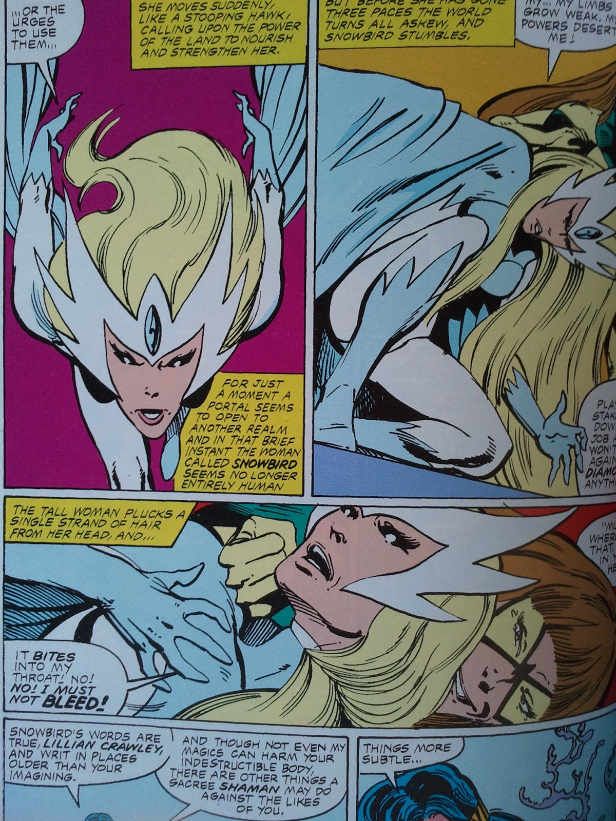
Fortunately there was a lot of other interesting storylines going on that held my interest in other, less raging hormone levels. Issue 23 was another winner, with the fate of Snowbird and Sasquatch coming to a head. I remember walking up to 7-11 with my sister on a brisk, sunny March Sunday morning and buying that one. I read it three or four times that day alone. I could not believe what happened in that issue. I was devastated. That is one of the biggest drawbacks to the Internet: the joy of discovery. In these Little House on the Prairie-esque pre-Internet days, the term spoilers did not exist. In fact, barring missing an issue, nothing was ever spoiled for me back then. It is a luxury that modern day fandom can never regain, for better or for worse.

Issue 23 was the first issue featuring the then-new flexograph printing process, which used water based ink instead of the traditional oil based ink. It also employed plastic/rubber plates instead of metal ones. The results were underwhelming to me as a kid. The colors looked overly bright and garish, the blends were horrid, with blacks just sitting there, and the printing was even less consistent than the old four color printing process. I remember this being touted as a printing breakthrough on the old Bullpen Bulletins page. The paper was a brighter white and smelled different, and everything just felt cheap to me. It was bad enough that comics had recently been jacked up 5 cents in price, but now we had inferior printing processes too? It was enough to give my 11-going-on-12-years-old OCD self the blues. 

Yes, the lighting is bad in all of these pictures.
Issue 24 was a double-sized extravaganza which found the team on a quest to recapture the soul of Sasquatch (Walter Langowski). Lots of cool battles with The Great Beasts in that issue. The return of Guardian in issue 25 made me happy, and the return of Omega Flight in issues 26 and 27 and that reveal was another jarring experience for me as a reader. I looked so forward to each and every issue, and I would devour them as soon as I got them, doing re-reading marathons every month.

It was around issue 27 when Byrne's artwork made a transition from his more polished style to a slightly looser, rawer one. This would continue until his artwork devolved into a scratchy mess in the late '90s. Fortunately he has seen a remarkable return to form over the past decade and is producing some great stuff over at IDW (Cold War, Next Men, etc.) 


The pages from Secret Wars II No. 4 are included as a bonus bridging material in between issues 27 and 28. Their inclusion is necessary because they show how the Beyonder rescued Talisman from Shaman's medicine bag. While it was recapped in issue 28, it is a nice bonus and a shining example of how Marvel's Collected Editions Department is way better at what they do than DC's Collected Editions Department.

Issue 28 was also, unbeknownst to me until reading the final page, John Byrne's final issue. I was horrified. How could Byrne do this to me? How could he leave my beloved Alpha Flight? It was announced that The Incredible Hulk creative team of writer Bill Mantlo and artists Mike Mignola (pencils) and Gerry Talaoc (inker) would be swapping titles with Byrne. Byrne went to their title, and they went over to Byrne's. Also clever was how the swap occurred during a crossover. Not only was issue 28 a Secret Wars II crossover, but a Hulk one as well! So Mantlo wrapped up his years-long Crossroads saga with the Hulk coming back to Earth. I ran out and bought Incredible Hulk No. 313 to sample this new creative team. I enjoyed how they showed what was going on from the Hulk's viewpoint before he came back to our dimension. Very cleverly orchestrated, bringing three titles in sync like that while switching creative teams. 

Artwork by Mike Mignola and Gerry Talaoc.
These days Alpha Flight and Hulk would both be given new number 1s. Back then, numbering was sacred. I miss that. Another interesting thing is how Mantlo hit the ground running on Alpha Flight. He obviously studied the entire series and came aboard full of references to past storylines and a pretty good understanding of the characters to boot. Bill Mantlo was the victim of a hit and run accident while he was on rollerblades and is living in deplorable conditions in an assisted living home. I hope that the royalties he gets from these reprints in collected editions like this help him out.

Mike Mignola was pretty much a nobody at this time. I knew of him from the Rocket Raccoon mini-series (yes, I was one of five people who actually bought it at the time). Gerry Talaoc was, unbeknownst to me at the time, a veteran DC artist. Issue 29 was completely different in tone and feel but was still really good. I stuck with the title until issue 70 or so. I really hope that this line of trade paperbacks continues, as Mignola is a big name these days with Hellboy, and later issues feature artwork by some new guy that never amounted to anything: Jim Lee.
Junk Food For Thought rating: 5 out of 5.

The OCD zone- Alpha Flight should have been given the Marvel Masterworks treatment; deluxe hardcovers, sewn binding, the whole bit.

Linework and Color restoration rating: 5 out of 5. I did side by side comparisons with my originals, and things are as spot on as can be.

Paper rating: 5 out of 5. This book uses the same beautiful dull matte finish coated stock paper that the softcover Masterworks use. I love it.

Binding rating: 4 out of 5. Glued binding.

Cardstock cover coating rating: 5 out of 5. Marvel's typical high quality lamination makes me a happy OCD camper.


Friday, June 7, 2013

Review- ALPHA FLIGHT CLASSIC VOL. 2


ALPHA FLIGHT CLASSIC VOL. 2 (Marvel, 2011; Softcover)

Collects Alpha Flight Nos. 9-19 and Uncanny X-Men No. 109 (cover dates: UXM- February, 1978; AF- April, 1984- November, 1985)

Writer and Penciler: John Byrne (and Inker issues 9-14, 17)

Writer: Chris Claremont (portions of Issue 17 and UXM 109)

Inkers: Bob Wiaceck (15, 16, 18), Keith Williams (19), and Terry Austin (UXM 109, portions of issue 17)

This run of comics is as near and dear to my heart as it gets. I started buying this title with issue 17 in September of 1984 (cover date December, 1984). I thought that the cover was so badass that I had to pick up this strangely titled comic off of the spinner rack at 7-11 and leaf through it. I saw Wolverine and that incredible John Byrne artwork and I was in. Yes, even at age 11 I was nit-picky about artwork and the like. But more on that particular issue later.


I was able to procure back issues of the title for cheap in 1985, and so I had read all of these by late 1985. Issues 9 and 10 are a Sasquatch fan's dream. I loved the Sasquatch versus the Super Skrull battle royale as a kid, and even more so as an adult. I like how dysfunctional and fractured the team is. In fact, the team doesn't even appear as a team between issues 1 and 12. Scene shifts and back-up stories ensure that the characters and subplots all get their turn, but Byrne really seemed to throw everything up in the air and juggle the characters around like balls. The most amazing thing about this is that he didn't drop a single one. Everything was mapped out perfectly without coming off as overly labored or stale. The life and energy of old comics was still apparent within the confines of the modern story arc structure. 


Issue 11 is where the seeds of the earlier issues start to bear fruit. This is one of the all-time greatest set-ups, in my opinion. The battle between Alpha Flight and Omega Flight in issue 12 is fantastic. The scene where Northstar smashed Wild Child into the wall has long been a favorite of mine.

Speaking of Northstar, it should be noted that he was the first gay superhero. This may sound like a big “so what” to younger readers, but back in the Ronald Reagan, ultra-conservative America of the mid-80s, this was huge. Byrne had to be sneaky about it since then Editor-In-Chief Jim Shooter wouldn't allow him to come out and say that Northstar was gay. Mind you, this was the era of the Comics Code Authority and newsstand distribution, and any flack could be catastrophic to a comics publisher. They didn't court controversy at this time, they avoided it.


There were enough hints dropped that I figured out Northstar was gay at age 12. There wasn't an over-hyped press release or anything, it was merely presented as an organic character development. I took it matter-of-fact-like at the time and shrugged it off. It didn't bother me then, and it doesn't bother me now. I think that when creators make it an overt attempt at getting a headline then they make it an issue...and then defend it by saying that it's not. None of which does anything to help gay people with acceptance, which is what these schlocks all claim to be doing.

Issues 14-16's Marrina/Sub-Mariner/Puck/The Master of the World arc is great, great stuff, but it was issue 17 where I came in. Little did I realize that much of the issue was a re-cut reprint of Uncanny X-Men No. 109. I didn't know and I didn't care. All that I knew was that the battle between Wolverine and Guardian (then known as Weapon Alpha) was badass. I read that issue dozens of times, and I mean that literally. Dozens. My family was poor and we didn't have cable, so I would read every comic book that I had dozens of times. I can still recite that issue word for word. 

From Alpha Flight No. 17 and/or Uncanny X-Men No. 109. John Byrne was unstoppable during this era.
Issues 18 and 19 feature the coming of the Talisman, in a story where the team travels back 100 years into the past to do battle with one of the seven Great Beasts of the North. Sinister things have been happening to Snowbird, a child of the Gods sent to do battle with the Beasts. Trouble is brewing, and while I didn't catch it at the time, I can now see all of the hints dropped at what was going to happen in issue 23.

I loved these comics as a kid, and I love them as an adult. I got totally different things out of them as an adult, which is to be expected I suppose. I latched onto the more accessible superhero aspect of the title as a kid, and while I enjoyed the characterization of the team members then, I really enjoyed it now.

It's nice when something that you loved so much as a child still holds up in every way as an adult. Alpha Flight was ahead of it's time, and yet very much of it's time. Fans of so-called “sophisticated” modern comic books owe it to themselves to check this series out.
Junk Food For Thought rating: 5 out of 5.

The OCD zone- Alpha Flight should have been given the Marvel Masterworks treatment; deluxe hardcovers, sewn binding, the whole bit.

Linework and Color restoration rating: 4.25 out of 5. Everything looks fine except for Puck's face being shaded incorrectly in issue 17 and some linework dropouts and mediocre color line blends in issue 19. I'm not sure if the film for issue 19 is in bad shape or if the colorist did a “spray paint/ airbrush” willy-nilly coloring job and obliterated some lines in a few places. If you had never seen the original issues you might not notice it. I have these comics burned into my brain and can detect the slightest problem with restoration. I have provided several examples below.

Original comic book. I never noticed how crappy the original printing methods were until I compared my originals with this trade paperback.
The original color palette is faithfully maintained.
 
Original from issue 17.
Incorrect coloring on Puck's face. This type of highlighting was present on the original for issue 18. The spot on Puck's lapel is simply a printing error. Does YOUR copy have this?

My original issue 19 side-by-side with the trade paperback. Note how much linework is obliterated on this page. This page is the worst-case example, but much of issue 19 looks subpar in my opinion.
Paper rating: 5 out of 5. This book uses the same beautiful dull matte finish coated stock paper that the softcover Masterworks use. I love it.

Binding rating: 4 out of 5. Glued binding.

Cardstock cover coating rating: 5 out of 5. Marvel's typical lamination makes me a happy OCD camper.