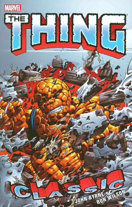
Showing posts with label Classic. Show all posts

Tuesday, July 7, 2015

Review- THING CLASSIC VOL. 2


THING CLASSIC VOL. 2 (Marvel, First Printing, 2012; Softcover)

Collects Thing #11-22 and Fantastic Four #274 (cover dates May, 1984- April, 1985)

Writers: John Byrne, Mike Carlin (#14-17), and Bob Harras (#18)
Artists: Penciler- Ron Wilson and John Byrne (FF #274) and Inkers- Joe Sinnott, Andy Mushynsky, Danny Bulanadi, Mike Gustovich, and Al Gordon

I have been on something of a Marvel kick lately, part of my mourning the death of these characters and the Marvel Universe as I once knew it. I am not just referring to the recent Secret Wars mini-series, but what I now refer to as Marvel A.B. (After Bendis). You can point to Avengers Disassembled as the beginning of the end for these characters. While there were certainly many enjoyable moments after 2003, the tone and feeling made a turn for the worse, growing from crossover to crossover to pointless, endless reboot after reboot. Nothing matters any more. Neither continuity nor legacy numbering nor characterization that ring true to the foundations of these characters. If it doesn't matter, then none of it matters, and I no longer feel compelled to follow the “All New All Different Marvel”. Bendis has done what DC could never do: Make me hate Marvel Comics, further cementing my conspiracy theory that he is a double agent sent by DC to destroy Marvel from within. My Marvel Comics Group is dead and gone.

Not everything needs a #1 to be a jumping on point, you know. I picked it up #19 of this title one cold rainy morning before school off of a spinner rack at 7-11. My Mom sent me into to buy her a pack of cigarettes and told me that I could get a comic. The cover of #19 grabbed me and that was it. Did I mention that I was eleven years old, and that in 1984 it was a-okay for a kid to go into a store and buy smokes as long as they said that it was for their parents? Of course I knew who The Thing was, as I read Fantastic Four back then, but I didn't know that The Thing was on Battleworld or that this was part 6 of the Rocky Grimm, Space Ranger arc or anything else that was going on. I was able to come into this series cold and have a good idea what is going on.

#19 crossed over with Fantastic Four #274 (also released on the newsstand in October of 1984) creating an awesome Monster Mash indeed. Over the course of those two issues the Thing fought a vampire, a mummy, Frankenstein's monster, and a werewolf. It doesn't get any more badass than that, and my then-11 year old self loved it to death. I read those issues countless times that fall and can almost recite them word for word to this day. I also bought #22 off of the spinner racks, likely because I had received some money from a relative for Christmas.


Aside from those three issues, these were all new reads to me. I bought #24, 30, 35, and 36 off of the spinner racks when they were released, which would be collected in a hypothetical Volume 3. One more fifteen issue trade could finish this line, collecting issues 23-36 and West Coast Avengers #10. This book is already three years old and it hasn't happened yet, so the likelihood of it ever happening is slim.

The Thing decided to stay on Battleworld following the conclusion of the Secret Wars because he could change back and forth to his human form of Ben Grimm at will due to the unique nature of the planet. He also wanted to sort out his feelings for Alicia Masters. Reed Richards (Mister Fantastic) gave him a slim card-sized device which, with the press of a button, would transport him back to Earth. With that in mind, Ben Grimm set off on a sort of vision quest.

Mild 30+ year old spoilers from here on out. It's kind of difficult to touch on a lot of points in this book without tipping my hand a little. The planet reacted to the subconscious thoughts of Ben Grimm, pulling all of his fears and desires and twisting them into bizarre scenarios and people. Ben faces many truths about himself, such as why Reed Richards being the leader of the Fantastic Four is really the best thing for them because Ben's own leadership skills are lacking. He experiences blindness at the hands of the Reckoner, giving him insight into Alicia Master's world and fatherhood when he and Tarianna find an orphaned infant, albeit temporarily for both. The biggest truth that he faces is that he is The Thing and The Thing is him. It is this realization that makes him come to terms that all of us face in adulthood: we are in truth our own best friend and worst enemy in one.

All of this heady psychoanalysis could have been painfully dull but wasn't because it was done with plenty of action and fun, something sorely lacking from modern Marvel Comics. See, we are supposed to be past this, as comic books are sophisticated and mature adult art, right? I dunno, I enjoyed this as a kid and I enjoyed reading these issues as a forty-something. I don't need profanity or sexual situations to feel that I am reading something “mature”. Those things seem painfully adolescent to me, but then again I am a dinosaur, right? Unlike modern comic creators and fans, I don't feel that superheroes are stupid, nor do I think that the people who like them are stupid. This Haha we are all in on the joke, aren't superheroes stupid? mentality has ruined comics.


John Byrne's writing is tops, and the art team of Ron Wilson and Joe Sinnott can't be beat. Wilson's Thing ranks up there with the best: Kirby, Perez, and Byrne. I cannot recommend this book enough to fans of superhero comics, fun, and life. If you hate fun or life, there are plenty of comics being produced today that will fill that void for you.
Junk Food For Thought rating: 4.75 out of 5.

The OCD zone- Nothing unusual to report.
Linework and Color restoration: Excellent and true.
Paper stock: Matte coated stock of sufficient thickness and weight. This is the same stock found in the softcover Marvel Masterworks and Epic line books, and is my favorite paper stock being used in collections today.
Binding: Perfect bound trade paperback.
Cardstock cover notes: Laminated cardstock. 

Sunday, November 11, 2012

Review- CLASSIC G.I. JOE VOL. 14


CLASSIC G.I. JOE VOL. 14 (IDW, 2012; Softcover)

Collects G. I. Joe: A Real American Hero Nos. 135-145 (originally published by Marvel Comics, cover dates April, 1993- February, 1994)

Writers: Larry Hama (except 143)

Artists: Andrew Wildman, Chris Batista, and others

Wow. Things go downhill so fast that they should have sold this book with a parachute to prevent injury. For starters, the title of the book temporarily changes to G.I. Joe Starring Snake Eyes and Ninja Force. That alone should tell you how kewl and !!!extreme!!! things get here. Andrew Wildman's artwork deteriorates here, getting all scratchy and unfocused like the Image brethren. Who thought that this style of artwork was appealing in the first place? What was the matter with you people in the '90s?? 


The first chunk of the book is basically Destro and ninjas battling it out with Cobra Commander for a castle. Then there's a Transformers crossover that does little to help things out. Issue 143 is an inventory story obviously thrown in because of a missed deadline. Then we get a retelling of Snake Eyes' origin in 144. Phil Gosher takes over the art in 145, and he sucks even worse than Wildman's Image-flavored crap.


Junk Food For Thought rating: 2 out of 5.

The OCD zone- What happened? Was IDW disappointed that Volume 13 was mostly readable? 
Ugly, ugly pixelation. Look at the outline of that word balloon. I lost a full night's sleep over that.
Linework restoration rating: 1 out of 5. Things start out decent, but it's almost like the budget ran out and they cut corners for the rest of the book. This is the worst pixelation that I've seen in any collected edition in the last 10 years. This is inexcusable. 
IDW must have hired a first semester intern to do the restoration here. They should be embarrassed.
Color restoration rating: 3 out of 5. Some of the issues have more muted colors, probably an attempt by the colorist to try and replicate the more subdued color of pulp paper. It doesn't look bad, but other issues look terrible. I don't understand how both the coloring and the linework restoration quality can vary from page to page within the same issue. One page will look okay, the next will have pixelation or crappy airbrushed looking gradients.

Paper rating: 4 out of 5. Heavyweight, bright white coated stock that gives too much glare.

Binding rating: 4 out of 5. Glued binding. Nothing to get excited about here.

Cardstock cover coating rating: 4 out of 5. Not bad, should hope up over time. The corners are a bit soft and can be easily dinged.

Saturday, November 3, 2012

Review- CLASSIC G.I. JOE VOL. 13


CLASSIC G.I. JOE VOL. 13 (IDW, 2011; Softcover)

Collects G. I. Joe: A Real American Hero Nos. 124-134 (cover dates May, 1992- March, 1993)

Writer: Larry Hama

Artist: Andrew Wildman and Rurik Tyler (132 only)

There are equal parts goodness and stupidity sprinkled throughout the issues in this book. Some ideas, like Firefly being a ninja, are totally stupid. Others, like the assault on Cobra Island, are great fun. There are no hard and fast rules on where the goodness and suckiness occur.


While the concept of having artwork on the front cover of the book that doesn't quite match the artwork in the rest of the book was started by Marvel when they released Volumes 1-5 a decade ago, that is no reason that IDW had to go and keep this crappy tradition going. Seriously. Look at this book's cover by Jonboy Myers. It sucks, and I feel that using any one of the issue's covers for each book would give them more “curb appeal”. 


Issue 125 was a split issue not unlike what John Byrne did back in Fantastic Four #277 in 1985, where he used two existing subplots and assigned them a top and bottom arrangement throughout the issue. Issue 124 was split in three parts across each page in much the same way. Larry Hama is a good writer when he is allowed to cut loose and have fun like he did in those two issues. 


There are some ideas in these issues that really, really suck, such as the G.I. Joe Eco-Warriors and Cesspool and his sludge weapons. There are some good ideas, too, like shifting the focus on the series to Snake Eyes again. Snake Eyes was the first G.I. Joe doll that I got back in 1982 at age 9 (I'm talking pre-swivel arm battle grip Snake Eyes, folks), and was always my favorite. The only problem with him is that he cannot speak so you need someone such as the now-good guy Storm Shadow to relay what he is thinking or meaning to say to others. It gets tiresome quickly. 

Read that dialogue. Just read it.
There are some fun action sequences, but much of this book was marred by the Image influence in the artwork department. Image was a big deal at that time, and every artist was scrambling to incorporate that razzle dazzle into their style. I blame the Image artists for the speculation boom that nearly destroyed the entire industry.
So yeah, the series is going down the tubes by this point, having long since lost its focus and is weaving and bobbing about. I am well into Volume 14 as I am writing this, and it is apparent that the train has gone off of the rails. Will things get back on track by the time that the original series end in Volume 15? Time will tell.
Junk Food For Thought rating: 2.75 out of 5.

The OCD zone- 240 pages of remastered comic books.

Linework restoration rating: 3.5 out of 5. This looks worlds better than Vols. 6-12, with minimal defects which would be barely noticeable to the untrained eye. Minimal pixelation, very, very few dropped out lines...finally, this title gets the treatment it deserves.

Color restoration rating: 3.75 out of 5. While there are still crappy gradient shadings, there is also a marked improvement in the coloring in this volumes. I'm happy with the strides IDW has made between Volumes 12 and 13.

Paper rating: 4 out of 5. Bright, day-glo white high gloss stock which makes the colors look garish. It does smell great, though.

Binding rating: 4 out of 5. The glue is solid, with no creaking when you fan through the book.

Cardstock cover coating rating: 4 out of 5. The coating that IDW uses on their cardstock covers isn't quite as thick as Marvel's, but is sufficient and should hold up well with repeated handling.

Follow my blog on Facebook.

Join my Facebook group, DC Collected Editions Fans Who Want Sewn Binding and Books That Lay Flat, a watchdog organization dedicated to top notch production values in DC's collected editions.

Sunday, October 28, 2012

Review- CLASSIC G.I. JOE VOL. 12


CLASSIC G.I. JOE VOL. 12 (IDW, 2011; Softcover)

Collects G. I. Joe: A Real American Hero Nos. 111-123 (cover dates April, 1991- April, 1992)

Writers: Larry Hama and Herb Trimpe

Artists: John Statema, Rod Whigham, Herb Trimpe, and Andrew Wildman

I love what Larry Hama did on the title when I was growing up. It pains me to write this, but I have an obligation to be honest and to call them as I see them. This title has gone from lovable fun to loathable stupidity. Gone are nearly all of the semi-realistic military angles, in are high fantasy elements such as the G.I. Joe Ninja Force and Battle Force 2000. Not to be outdone, Cobra has Slice and Dice, a pair of evil ninjas. 

The worst artwork that the world has ever seen was done in 1990s comic books.

Longtime fans will be happy with the reintroduction of Zartan, Tomax, Xamot, and Billy (Cobra Commander's son). Undoubtedly inspired by the the events of Operation: Desert Storm in January, 1991, the Joes become involved in conflicts in the Middle East in fictitious countries such as Quagmahr, Benzheen, and Abysmia. I got a kick out of those names. 


Storm Shadow gets a Wolverine claw for his right hand during the all-out ninja stupidity. Snake Eyes and Cobra Commander get new costumes without any fanfare or acknowledgment. It's like Hasbro sent them the new action figure designs and then they were integrated. The clearest sign of this title “jumping the shark” is the introduction of the Eco-Warriors, which are the dumbest elements introduced into the G.I. Joe universe thus far. 

New costumes for Snake Eyes and Cobra Commander are unveiled here with no mention of how or why.
Junk Food For Thought rating: 2 out of 5.

The OCD zone- In true IDW fashion, this collection is lacking. The G.I. Joe Dossiers from Issue 111, 113-118, 120-123 (2 pages each), are omitted. You would think that they would've included those in the back of the book as DVD style extras, but no. IDW has repeatedly dropped the ball with this line of trade paperbacks, from omitting issues that crossed over with G.I. Joe Special Missions to the poor restoration in many of these volumes. 

Tight gutters abound. There is plenty of excess white border space on the pages. All they would have had to do is some slight cropping and move the image out 1/8 of an inch.
Linework restoration rating: 3.5 out of 5. The restoration is really hit or miss. It's decent and readable but doesn't make me feel all warm and fuzzy like I do when I read a Marvel Masterwork. I like to have that definitive, high-def BluRay expereince.

Color restoration rating: 2 out of 5. Ugly gradient shading, done by letting the computer fill in the shapes rather than doing them by hand on the computer. Cheesy airbrushed gradient effects make my blood boil. The original issues did not have that, so I perceive it to be an abomination.

Paper rating: 4 out of 5. Super heavy duty coated stock paper. This book weighs a ton for a softcover, clocking in at a chunky 280 or so pages. It's a high gloss stock which makes the colors look garish.

Binding rating: 4 out of 5. Glue in a cardstock cover. It doesn't creak when you fan through it and should hold up over time.

Cardstock cover coating rating: 4 out of 5. The laminated cardstock cover seems durable with repeated handling, and should fare well over a lifetime on your bookshelf.

Follow my blog on Facebook.

Join my Facebook group, DC Collected Editions Fans Who Want Sewn Binding and Books That Lay Flat, a watchdog organization dedicated to top notch production values in DC's collected editions.

Saturday, July 14, 2012

Review- POWER PACK CLASSIC VOL. 3


POWER PACK CLASSIC VOL. 3 (Marvel, 2011; Softcover)


Collects Power Pack Nos. 18-26 and Thor No. 363 (cover dates January- September, 1986)

Writers: Louise Simonson, Terry Austin (#21), and Walt Simonson (Thor 363)

Artists: Brent Anderson (#18-21), Jon Bogdanove (#22-26), Bob McLeod (#20, inker #22-26), Scott Williams (inker), Terry Austin (inker, #21), and Walter Simonson (Thor 363)

I've said it before, and I'll say it again. If any Marvel property is ripe to be used by Disney in a Pixar CGI animated film, it is Power Pack. I can't believe that there are not rumblings of some kind. This is a surefire, family friendly concept if ever there was one: Jim Power creates an anti-matter machine which will unintentionally destroy the world. Aelfyre Whitemane (Whitey as the kids named him), of an alien of the race called Kymellians, intervened because a similar incident destroyed his homeworld. The ZN^RX (Snarks as dubbed by the Power children), wanted the machine for a weapon, and fatally wounded Whitey, who transferred his powers to the four Power children. The Power kids, who dubbed themselves Power Pack, also inherited his Smartship Friday. Yes, Marvel used the term Smartship back in 1984.

Artwork by Brent Anderson.
All of those events occur in the first volume of this series. By this point in the title the children are dealing with minor social issues and are plagued with guest stars, all of which caused declining sales and saw the title dropped from newsstand distribution with Issue 26 and become a bi-monthly Direct Market (comic shop) only title. I bought every one of these off of the stands, and began buying from the Direct Market exclusively in May of 1986, so this was no big deal to me at the time. 

Artwork by Jon Bogdanove
This title still holds up for the most part. We get treated to early Brent Anderson (Astro City) art, and Terry Austin (Uncanny X-Men, Avengers) also pops in for a while. Bob McLeod's artwork on issue 20 is great, and it also guest stars The New Mutants, a title that he helped launch several years earlier. I remember walking up to 7-11 in the snow on a Saturday evening in December of 1985 and buying that one. Louise Simonson's scripts have real heart to them, and it's a shame that this series has never caught on in any real way. 

Artwork by Bob McLeod.
I hope that we see more volumes in this line of trade paperbacks, but wouldn't be surprised if we didn't. They haven't exactly been burning up the iCv2 sales charts.

Monday, July 2, 2012

Review- NAMOR VISIONARIES: JOHN BYRNE VOL. 1


NAMOR VISIONARIES: JOHN BYRNE VOL. 1 (Marvel, 2011; Softcover)


Collects Namor, The Sub-Mariner Nos. 1-9 (cover dates April- December, 1990)

Writer and Artist: John Byrne

I am a huge John Byrne fan. I met Byrne at the Mid-Ohio Con in 2004, and he was very gracious, answering all of my inane X-Men questions for what must have been the thousandth time. I know that many people have issues with the man and his opinions. I say separate the art from the artist.

I missed this series when it was originally published, as I was on sabbatical from the hobby at the time. The gist of the series is simple. Prince Namor, the Sub-Mariner, is repulsed by man's destruction of his ocean environment. He decides to combat pollution, so he once again wages war against the surface world...on the surface world's own terms. He uses sunken treasures to make himself rich, and buy a corporation, which he names Oracle. This was a pretty timely topic, as I recall never even hearing of Earth Day until the much hyped 20th anniversary in 1990. Byrne was ahead of the game, seeing as how he would have been working on this in the fall of 1989. As of this point in the series, Namor hasn't really done anything to help Mother Earth, but we'll see, right?


Most of the foes that the Sub-Mariner tangles with are environmental monsters, and are a cross between Atlas era Kirby monsters and Byrne's Alpha Flight Great Beasts in appearance. There are lots of great action sequences here. Namor's main foils, the Marrs twins, heads of the Marrs Corporation, are not super villains at all.

Byrne's art in issue 4 takes a strange turn, as he goes for a type of blueish shading similar to Bill Everett's original take on the character in his first appearance Marvel Comics #1 back in 1939 (itself a colorized reprinting of Motion Picture Funnies Weekly #1). 


Not everything here is gold, though. Headhunter is a downright corny villain, and the reveal at the end of the arc was lame. Still, this was a fun read with plenty of action and good Byrne artwork. Volume 2 has been solicited and will be released this summer.

The OCD zone- Wonderful, dull matte finish coated stock paper which brilliantly captures the flat colors and provides an authentic, yet high end feeling, comic book reading experience. My OCD swooned!