

CLASSIC G.I. JOE VOL. 14 (IDW, 2012; Softcover)
Collects
G.
I. Joe: A Real American Hero
Nos.
135-145 (originally published by Marvel Comics, cover dates April,
1993- February, 1994)
Writers:
Larry Hama (except 143)
Artists:
Andrew Wildman, Chris Batista, and others
Wow.
Things go downhill so fast that they should have sold this book with
a parachute to prevent injury. For starters, the title of the book
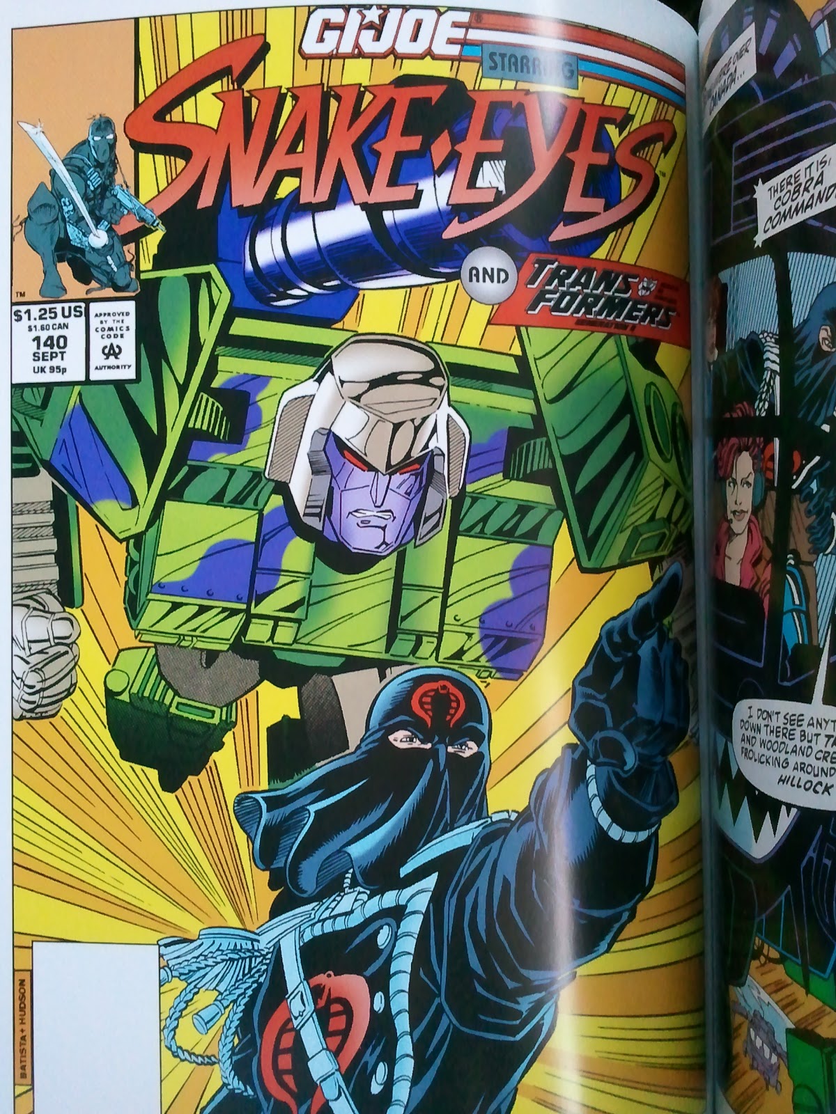
temporarily changes to G.I. Joe Starring Snake Eyes and Ninja
Force. That alone should tell you how kewl and !!!extreme!!!
things get here. Andrew Wildman's artwork deteriorates here, getting
all scratchy and unfocused like the Image brethren. Who thought that
this style of artwork was appealing in the first place? What was the
matter with you people in the '90s??

The first chunk of the book is basically Destro and ninjas battling it out with Cobra Commander for a castle. Then there's a Transformers crossover that does little to help things out. Issue 143 is an inventory story obviously thrown in because of a missed deadline. Then we get a retelling of Snake Eyes' origin in 144. Phil Gosher takes over the art in 145, and he sucks even worse than Wildman's Image-flavored crap.
Junk Food For Thought rating: 2 out of 5.
The
OCD zone- What happened? Was IDW disappointed that Volume 13 was
mostly readable?
 |
| Ugly, ugly pixelation. Look at the outline of that word balloon. I lost a full night's sleep over that. |
Linework
restoration rating: 1 out of 5. Things start out decent, but it's
almost like the budget ran out and they cut corners for the rest of
the book. This is the worst pixelation that I've seen in any
collected edition in the last 10 years. This is inexcusable.
 |
| IDW must have hired a first semester intern to do the restoration here. They should be embarrassed. |
Color
restoration rating: 3 out of 5. Some of the issues have more
muted colors, probably an attempt by the colorist to try and
replicate the more subdued color of pulp paper. It doesn't look bad,
but other issues look terrible. I don't understand how both the
coloring and the linework restoration quality can vary from page to
page within the same issue. One page will look okay, the next will
have pixelation or crappy airbrushed looking gradients.
Paper
rating: 4 out of 5. Heavyweight, bright white coated stock that
gives too much glare.
Binding
rating: 4 out of 5. Glued binding. Nothing to get excited about
here.
Cardstock
cover coating rating: 4 out of 5. Not bad, should hope up over
time. The corners are a bit soft and can be easily dinged.
No comments:
Post a Comment