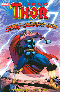
THOR VS. SETH, THE SERPENT GOD (Marvel, 2010; Softcover)
Collects Thor Nos. 395-400 (cover dates September, 1988- February, 1989)
Writer: Tom DeFalco
Artist: Ron Frenz (penciler) and Don Heck, Brett Breeding, Joe Sinnott, and Charles Vess
Tom DeFalco and Ron Frenz are favorites of mine. I will always have a soft spot for this creative team, as they were at the helm on The Amazing Spider-Man during my golden age (mid '80s) of comics. DeFalco channels Silver Age Stan Lee, and Frenz channels Silver Age Kirby here. What is interesting to me is that Frenz channeled Silver Age Ditko on his Spider-Man run. Even his panel composition is prime Kirby, with the bystanders pointing at the events going on, etc.
These issues are wonderful nods to what is obviously the pair's favorite era of comics. DeFalco and Frenz grew up during Marvel's Silver Age, and are, in my opinion, worthy heirs to Lee and Kirby. Unlike many of today's “star” creators, they served the character and the story rather than themselves. They weren't trying to redefine the character or put their stamp on it, but were trying to build on the foundation set forth by previous creators. I have immense respect for that.
I was never a Thor fan growing up. I read the occasional issue and enjoyed him as an Avenger, but my limited funds back in the '80s kept me away from experimenting on a lot of titles. I was unaware that DeFalco and Frenz were even on this title until this trade paperback was solicited. Had I realized that they were on Thor back then, I probably would have bought it monthly. I enjoyed this book, even though Thor still talks funny. The Earth Force were a tad cheesy, but were a fun Silver Age flavored nod.
It is no secret that I love the flat colored, more “comic book looking” comic books from the days of yore. While I marvel at, and appreciate, modern computer coloring, much of it is just too perfect for my tastes. One area of modern comic books that I prefer to older comics is lettering. Using fonts is superior to most of the old hand lettered jobs like we get here. John Workman's lettering is abominable, and actually detracts from the overall reading experience. Unless it's Artie Simek, Sam Rosen, or Tom Orzechowski (and maybe John Constanza), I can do without it. On an unrelated note, I would pay money for an Artie Simek font for my computer.
The OCD zone- The paper used in this book is wonderful, and is roughly the same grade used in the softcover Masterworks. It has a dull matte finish, but it is a coated stock and looks and feels nice. The restoration is excellent.
Join my Facebook cause page to help raise awareness to DC's problem of high end hardcovers with glued binding that don't lay flat. Stand up and be counted!


No comments:
Post a Comment