Wednesday, May 1, 2019

Review- THE AMAZING SPIDER-MAN OMNIBUS VOL. 2


THE AMAZING SPIDER-MAN OMNIBUS VOL. 2 (Marvel, First Printing, 2012; Hardcover)

Collects The Amazing Spider-Man #39-67, Amazing Spider-Man Annual #3-5, The Spectacular Spider-Man #1, 2, and the Spider-Man stories from Not Brand Echh #2, 6, 11 (cover dates August, 1966- December, 1968)

Writer: Stan Lee

Artists: John Romita, Sr. with Don Heck, Larry Lieber, Jim Mooney, Marie Severin, Mike Esposito, Bill Everett, and Frank Giacoia


While I love Steve Ditko, I prefer the artwork of John Romita, Sr. a whole lot more. I remember teenage me arguing with some nerds at the comic shop circa 1987. This guy said Ditko all the way. I argued that Ditko is great and laid the foundation, but it was John Romita, Sr. who defined the contemporary Spider-Man that we know and love. This was right before Todd McFarlane would do a hard reset and make Ditko the only acceptable reference point for the character for decades to come. Those of us who were Bronze Age children know Romita's version as the one who adorned t-shirts and luncboxes.


This stuff is art of the highest order. There are too many highlights for me to do a blow by blow, but I'll take a shortcut and tell you that if you are not familiar with this run that it is top shelf material and it belongs in everyone's library.


The OCD zone- This is the part where I go into tactile sensations and materials used in physical media. Those with heart conditions, high blood pressure, or women who are pregnant should exit my blog at their earliest convenience, as their safety cannot be guaranteed beyond this point.


PLEASE NOTE THAT THE FOLLOWING APPLY TO THE 2012 FIRST PRINTING OF THIS BOOK.

Linework and Color restoration: There are a couple of issues here which look like they could be improved upon if better source material surfaced. I am uncertain if the second printing of this book used any original artwork which may have surfaced since this book was released.


Paper stock: Coated stock with a slight sheen. This is closer to glossy than matte.

Binding: Sewn binding. Like many older Omniboo, this has developed the dreaded Omnibus sag due to gravity and the weight of the book block. Some folks use post it note pads to prop up the block, others store them spines down. I like to live dangerously and store my books vertically.

Dustjacket and Hardback cover notes: Laminated dustjacket. The hardback has faux leather grain and dye foil stamping. The second printing does not have that.


The hardback has ugly creases on it after reading it.

Sunday, April 28, 2019

Review- DAUNTLESS DURHAM OF THE U.S.A.: 1913-1914


DAUNTLESS DURHAM OF THE U.S.A.: 1913-1914 (Hyperion Press, First Printing, 1977; Hardcover)

Collects Dauntless Durham Of The U.S.A. daily strips from January 22, 1913-January 31, 1914

Writer and Artist: Harry Hershfield


Harry Hershfield's vaudeville melodrama is a charming snapshot of a world long gone. It was a backward looking piece even in it's day, with ironic takes on villains of the late 19th century. Durham seeks the hand of his beloved Katrina in marriage. At first Lord Havaglass was trying to steal her away, but he was soon replaced with Desmond, the star of Hershfield's previous strip Desperate Desmond. This is when the series really gets going.


Desmond launches one caper after another trying to steal Katrina away. I mean he literally tries to steal her away, as kidnapping must not have been as frowned on back then as it is today. The capers and pissing contents between Durham and Desmond run the gamut of the absurd. There is a real charm to this strip.


Unlike many strips of the era, minorities are portrayed across the board as a melting pot, with stereotypes used as less caricature or more characteristic. There is a huge difference, as one is intended to offend and the latter offends because times and society has changed. One must use proper historical context when reading old material, because nothing from the past can measure up to the values of 2019.

I learned a lot of words when reading this book.

It is fascinating to see then-current events referenced (the new buffalo nickels, Hoover Dam, and many more). Old slang and old songs are referenced as well, and I had a blast using Google and YouTube to experience these as I read the book. It is incredible to be able to add an extra layer of reference to this material in a historical context.

This page is not in this book, but I provide it to demonstrate how this strip looked when originally published. Old newspapers were huge. 

Volume 194, No. 2 of The Official Gazette Of The United States Patent Office lists a claim use date of January 22, 1913 for this strip. American Newspaper Comics by Allan Holtz confirms this date as the start of this series. The Buffalo Enquirer ran the intro strip on January 25, 1913 with the story beginning on Monday, January 27, 1913. Pinning down dates on old strips is a wild game of dice, as syndication often meant that strips appeared on different days in different markets. (Thanks to Brent Swanson and Buddy Lortie of the Sunday newspaper comics 1890-1950 Facebook group for providing the answers for the second and third sentences of this paragraph.)


This strip ended when Hershfield created Abie The Agent, the long running strip which he is most remembered for. There is a nice happy ending to wrap things up. This strip is all but forgotten. Indeed, I wouldn't have even heard of it had I not checked Art Out Of Time from my local library and been exposed to it. I hope that Library Of American Comics will reprint this in one of their LOAC Essentials books, as that is the ideal format for this vintage of strip.


The OCD zone- This is the part where I go into tactile sensations and materials used in physical media. Those with heart conditions, high blood pressure, or women who are pregnant should exit my blog at their earliest convenience, as their safety cannot be guaranteed beyond this point.

Linework restoration: The primitive reproduction methods used in the stone age of 1977 yielded surprisingly decent results. I know that Library Of American Comics or one of the other publishers could do better today, but credit where credit is due. There area few spots that are bad in this book but given the tools that neanderthal 20th century man had to make this book with I would say that this is a good restoration job for the time and serviceable by 2019 standards.

Paper stock: Matte stock.

Binding: Sewn binding that has held up pretty well.

Hardback cover notes: You don't see textured casewrap like this anymore. Primitive man feared nuclear annihilation from Russia and used production methods that ensured that their books would survive the nuclear winter. 

Tuesday, April 23, 2019

Review- PLANET OF THE APES: WHEN WORLDS COLLIDE


PLANET OF THE APES: WHEN WORLDS COLLIDE (Boom, First Printing, 2019; Softcover)

Collects Planet of the Apes: The Time Of Man #1 and Planet of the Apes: The Simian Age #1 (cover dates October- December, 2018)

Writers: Jeff Jensen, David F. Walker, Ryan Ferrier, Dan Abnett, Phillip Kennedy Johnson, and Matt Kindt

Artists: Jared Cullum, George Schall, Lalit Kumar Sharma, Carlos Magno, Morgan Beem, and Matt Smith

Colorists: Jared Cullum, George Schall, Gabriel Cassata, Gabriel Cassata, Morgan Beem, and Joana Lafuente


This book compiles two giant-sized one-shots which were both anthologies of various points in Apes history. One was set in the original quadrilogy (sic?) continuity, the other in the more recent trilogy continuity. It's a fairly mediocre bunch of stories, perhaps the laziest Apes offering that Boom has done yet. It's like they are trying to kill the brand with these uninspired rehashes. The only ones that seemed worthwhile were the nod to the original Marvel black and white Apes magazines storyline Terror On The Planet Of The Apes and the Cloud And Rain story which showed Koba's subversion in action.


The OCD zone- This is the part where I go into tactile sensations and materials used in physical media. Those with heart conditions, high blood pressure, or women who are pregnant should exit my blog at their earliest convenience, as their safety cannot be guaranteed beyond this point.

Paper stock: Thick glossy coated stock.

Binding: Sewn binding.

Dustjacket and Hardback Cardstock cover notes: Thick cardstock with a matte finish.

Friday, April 19, 2019

Review- Shogun Warriors #1-20


Shogun Warriors #1-20 (Marvel, cover dates February, 1979- September, 1980)

Writers: Doug Moench and Steven Grant (#15 only)

Artists: Herb Trimpe with Inking by Dan Green, Al Milgrom, Jack Abel, Mike Esposito, Steve Mitchell, Bruce Patterson, Mike Vosburg (Pencils #15 only), and additional cover art by Terry Austin, Walt Simonson

Nostalgia is a funny thing. There are times when it's warm embrace is like a trusty old blanket, and then there are times when fond remembrances are best left in childhood. Like a lot of fortysomethings, I had Shogun Warriors toys as a kid. I had Raydeen and Great Mazinga in the '70s and loved them. They were solid toys that a kid could beat the heck out of and they kept on trucking.


I owned issues 1 and 14 as cheapo back issues circa 1983. I have been wishing and hoping for an Omnibus of this book for years. Over the years I pieced together a run of this title for little money, and started reading the series a while back.


The verdict? Well, Doug Moench is a fine writer who has done a lot of good work elsewhere. Herb Trimpe shines with silly Jack Kirby inspired monster stuff, and giant robots fighting giant monsters are right up his alley. The title has a certain pedigree of talent. The general vibe is that not a lot of effort went into this since it was a cheesy kids comic, which is fine since that was the intended audience for the toys and this comic book. There are times when the series is entertaining but by and large it, much like Marvel's Godzilla comic, were simply bottom rung Bronze Age titles which are now held in high regard solely based on nostalgia. That said, I can't wait to buy this in hardcover someday. Someday science will come up with a name for my malady. I offer the term Shaw Syndrome to science.

Monday, April 15, 2019

Review- MS. MARVEL EPIC COLLECTION VOL. 1: THIS WOMAN, THIS WARRIOR


MS. MARVEL EPIC COLLECTION VOL. 1: THIS WOMAN, THIS WARRIOR (Marvel, First Printing, 2018; Softcover)

Note: Book was actually released in 2019

Collects Ms. Marvel #1-14, Marvel Team-Up #61, 62, and Defenders #57 (cover dates January, 1977- March, 1978)

Writers: Chris Claremont and Gerry Conway

Artists: Jim Mooney, John Buscema, Sal Buscema, with John Byrne, Keith Pollard, Carmine Infantino, George Tuska, Dave Cockrum, Joe Sinnott, Dave Hunt, Tom Palmer, Frank Giacoia, Steve Leialoha, Sam Grainger, and Dan Green


The original series has held up really well, less damsel in distress and more strong independent career woman determined to make it, both as an editor of a magazine and as a superhero.


I was pleasantly surprised to see how forward thinking the writing was, but with Chris Claremont in charge for most of the book I should have known better. Claremont was ahead of his time in more ways than one.


The artwork is good, solid Bronze Age fun done by the usual journeymen of the day. I really enjoyed reading this book.


The OCD zone- This is the part where I go into tactile sensations and materials used in physical media. Those with heart conditions, high blood pressure, or women who are pregnant should exit my blog at their earliest convenience, as their safety cannot be guaranteed beyond this point.

Linework and Color restoration: This is the same restoration found in the Marvel Masterworks hardcovers. High def all the way.

Paper stock: Matte coated stock. This is a pinch whiter and glossier than what we have been getting in Epics so far but it's still nice.

Binding: Perfect bound.

Cardstock cover notes: Laminated cardstock cover.

Friday, April 12, 2019

Review- GUARDIANS OF THE GALAXY: TOMORROW'S AVENGERS VOL. 1


GUARDIANS OF THE GALAXY: TOMORROW'S AVENGERS VOL. 1 (Marvel, First Printing, 2013; Softcover)

Collects Marvel Super Heroes #18, Marvel Two-In-One #4, 5, Giant-Size Defenders #5, Defenders #26-29, and Marvel Presents #3-12 (cover dates January, 1969- August, 1977)


Writers: Arnold Drake, Steve Gerber, Roger Stern, Gerry Conway, Roger Silfer, Len Wein, Chris Claremont, Scott Edelman, and Stan Lee

Artists: Gene Colan, Sal Buscema, Don Heck, Al Milgrom, and John Buscema, with Mike Esposito, Frank Giacoia, Vince Colletta, Pablo Marcos, Howard Chaykin, Terry Austin, Bob Wiaceck, Dave Hunt, John Tartaglione, and Joe Sinnott


Reading this book was about as much fun as chewing chalk. Mediocre is the kindest word I use when describing these stories. This book is for masochists and completists only.


The OCD zone- This is the part where I go into tactile sensations and materials used in physical media. Those with heart conditions, high blood pressure, or women who are pregnant should exit my blog at their earliest convenience, as their safety cannot be guaranteed beyond this point.

It was acceptable for parents to hit their kids in the '70s. Believe me. 

Linework and Color restoration
: Fair but not Marvel Masterworks level. It doesn't matter though, as the material is weak and the best restoration in the world couldn't save it.

Paper stock: Matte coated stock. This is my favorite of all of the paper stocks, as it feels high end yet looks like a comic book.

Binding: Perfect bound.

Cardstock cover notes: Laminated cardstock cover.

Monday, April 8, 2019

Review- MARVEL MASTERWORKS: THE X-MEN VOL. 6


MARVEL MASTERWORKS: THE X-MEN VOL. 6 (Marvel, First Printing, 2014; Softcover)

Collects The X-Men # 54-66 (cover dates March, 1969- March, 1970)

Writers: Roy Thomas, Arnold Drake (#54), Linda Fite (#57), and Denny O'Neil (#65)

Artists: Neal Adams, Don Heck, Werner Roth, and Sal Buscema with Inking by Tom Palmer, Vince Colletta, and Sam Grainger


How many times can one person buy the same material? Let us count the ways. My first exposure was the X-Men Visionaries: Neal Adams trade paperback. While the stories blew my mind, the unfaithful coloring made me ill. I dumped it to buy the first upgrade, which was...


Marvel Masterworks: The X-Men Vol. 6, a nice book marred by wretched glued mousetrap binding. The awful tight binding made the next dip more palatable.


The X-Men Omnibus Vol. 2 not only boasted sewn binding, but was remastered again, even over the Masterworks! Wow, where do I sign, or so I thought at the time.


I then bought this book, which boasted the state of the art restoration, albeit it in softcover. I've also dipped again with the second X-Men Epic, although that was to get the remaining issues I lost when I dumped the second Omnibus. Clear as mud?


In any case, this is top shelf stuff and is eclipsed only by the Claremont and Byrne run. I am done with all of these endless dips for this material. This version is nice enough. At least Marvel cares enough about their material to revisit it every time superior source material appears. DC does restoration once and leaves it, which is unfortunate since they never try to fix subpar restoration.


The OCD zone- This is the part where I go into tactile sensations and materials used in physical media. Those with heart conditions, high blood pressure, or women who are pregnant should exit my blog at their earliest convenience, as their safety cannot be guaranteed beyond this point.

I loved the softcover Masterworks line, as the books are wider than a standard trade paperback. Marvel since went the Epic route, but I would have been happy buying softcover Masterworks.

Linework and Color restoration: This is the same upgraded linework and color restoration found in the second Omnibus.

Paper stock: Matte coated stock. This is my favorite of all of the paper stocks, as it feels high end yet looks like a comic book.

Binding: Perfect bound.

Cardstock cover notes: Laminated cardstock cover.

Wednesday, April 3, 2019

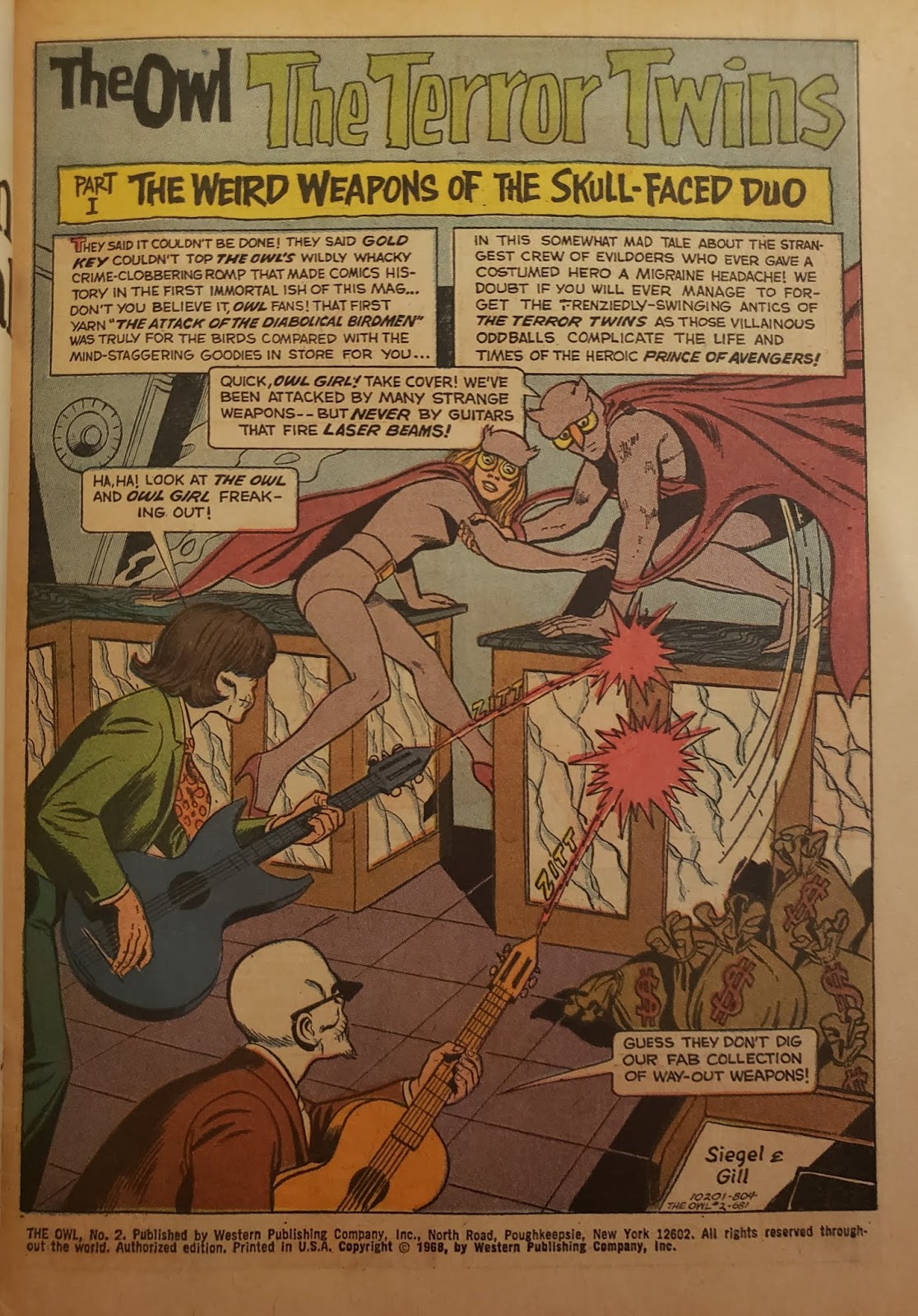
Review- The Owl #1 and 2


The Owl #1 and 2 (Gold Key, cover dates April, 1967- April, 1968)

Writer: Jerry Siegel

Artist: Tom Gill


This was a campy retread of the 1940s Dell series designed to ride the wave of campy Golden Age nostalgia in the wake of the 1966 Batman TV series. I enjoyed the heck out of the complete lack of self awareness combined with absurd, unnecessarily elaborate exploits. Gold Key Comics were always decidedly old fashioned and out of step yet charming, and these are no different. If you were a kid jingling some coins in your hand at the newsstand then this would have been buried by anything Marvel or DC were doing at the time. I guess that it never stood a chance, which is too bad since these were fun reads with solid artwork.


Apparently the character was revived as part of Dynamite's Project Superpowers universe a few years ago. That universe is comprised of public domain Golden Age superheroes who are retooled. There is also a more recent relaunch in inDELLible Comics' All New Popular Comics, another public domain riff.


The OCD zone- This is the part where I go into tactile sensations and materials used in physical media. Those with heart conditions, high blood pressure, or women who are pregnant should exit my blog at their earliest convenience, as their safety cannot be guaranteed beyond this point.


Old comic books smell great. They should make a candle that smells like rotting pulp paper.